
Google Is Giving Three Android Apps a New Look
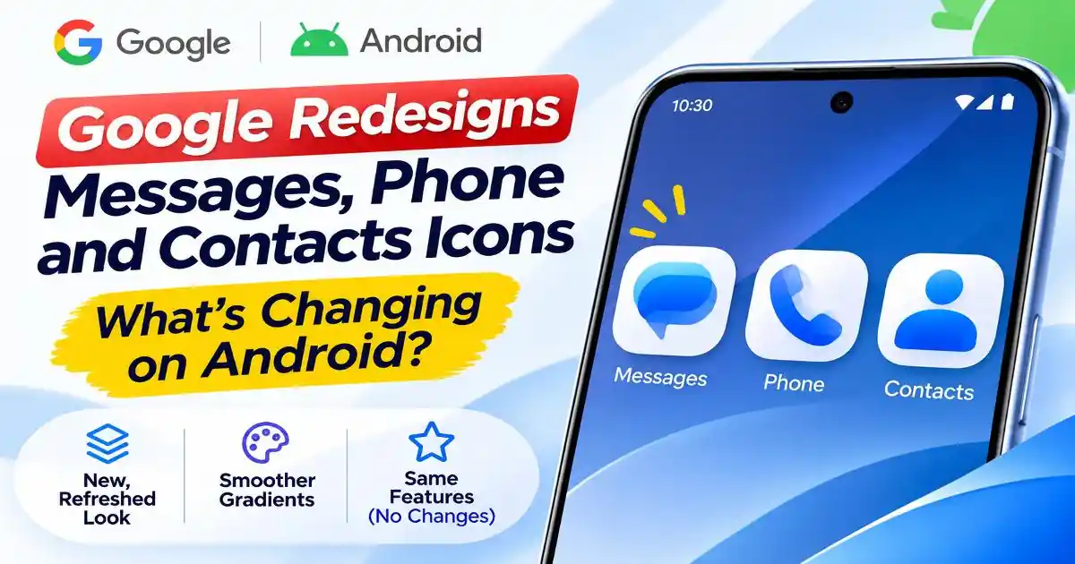
The Google app icon redesign is bringing a fresh visual appearance to three familiar Android applications: Google Messages, Phone by Google and Google Contacts. Announced on November 2, 2026, the update introduces refreshed colours, subtle gradients and sharper edges designed to make the icons look clearer and more consistent across the Android home screen.
Google says the redesign was developed with user feedback in mind. The company wants its communication apps to have a more cohesive appearance alongside other updated Google products. The rollout has started and will reach users gradually over the coming weeks.
There is one important detail: this is a visual update, not a major software upgrade. Google has explicitly confirmed that the functionality of all three apps remains unchanged.
Which Google Android Apps Are Getting New Icons?
The redesign covers three applications that many Android users rely on every day. Each receives updated styling while retaining its familiar purpose.
1. Google Messages
Google Messages is Google's messaging application for Android, supporting traditional SMS and MMS as well as RCS messaging where available. Its refreshed icon features a cleaner speech-bubble design with updated blue colouring and gradient treatment.
The aim is to make the icon appear sharper and easier to recognise on a phone's home screen. Users should continue to access their existing conversations and messaging features as before.
2. Phone by Google
Phone by Google is the company's calling application, used for making and receiving calls on supported Android devices. Its new icon follows the same updated visual direction, with refined colouring, curvature and gradient effects.
The announcement does not introduce a new calling feature or change how the dialer works. It is simply an updated appearance for the application.
3. Google Contacts
Google Contacts helps users manage saved phone numbers, contact information and synced address books. Its refreshed icon adopts the same design language as the other two apps, creating a more consistent appearance across Google's communication tools.
Existing contacts and account information are not being replaced by the icon update. Google has not announced any changes to contact-management functionality as part of this release.
What Has Changed in the New Google App Icons?
The redesign focuses on visual details rather than introducing completely different symbols. Google has highlighted three main design improvements.
- Subtle gradients: The updated icons use smoother colour transitions instead of relying entirely on flat colour fills. This gives the designs a more modern appearance.
- Sharper edges: Google says the icons are designed to look clearer and more recognisable on home screens, with more defined visual boundaries.
- Updated curvature and colouring: The shapes and colours have been refined to align more closely with Google's wider visual identity, including its core logo.
These changes follow a broader visual refresh across Google's products. The company has been introducing more consistent gradient-based styling across several of its applications. The Messages, Phone and Contacts update brings three important Android communication apps into that visual direction.
Will the New Icons Change How the Apps Work?
No. Google has clearly stated that the functionality of Google Messages, Phone by Google and Google Contacts is not changing because of this redesign.
Users can continue sending messages, making calls and managing their contacts in the usual way. The announcement does not introduce a new messaging protocol, additional calling tools or changes to contact synchronisation.
This distinction matters because app redesign announcements can sometimes be confused with major feature updates. In this case, Google is changing the external presentation of the applications rather than their underlying functionality.
When Will the New Google Icons Arrive on Android Phones?
Google announced that the refreshed icons would begin rolling out on November 2, 2026. The company says users should see the updated designs on their home screens over the coming weeks.
The announcement does not provide a specific completion date or a detailed schedule for individual phone manufacturers, countries or Android versions. Availability may therefore vary between devices and users.
Some early reports have also noted the updated Google Messages icon appearing in beta software. However, users should not assume that installing a beta version is necessary to receive the stable icon update.
How to Check for the New Google App Icons
Users who want to check whether the redesigned icons are available can follow these simple steps:
- Open the Google Play Store on your Android phone.
- Tap your profile picture in the top-right corner.
- Select Manage apps and device.
- Open the Updates available section.
- Check whether Google Messages, Phone by Google or Google Contacts has an available update.
- Install the available official updates and check your home screen again.
Google is rolling out the designs gradually, so an updated app may not immediately display the new icon on every device. If the icon has not changed, it does not necessarily mean that something is wrong with your phone.
It is also best to avoid downloading unofficial APK files or installing applications from unknown websites just to obtain the new icons. Waiting for the official rollout through Google Play is the safer option.
Why Is Google Updating Its Android App Design?
Google's latest icon refresh reflects a wider effort to create a more consistent visual identity across its products. Android users interact with many Google applications, and a shared design language can make those applications feel more connected.
Gradients, refined shapes and clearer edges also help distinguish icons on increasingly crowded home screens. Instead of giving each application an unrelated appearance, Google is bringing its communication tools closer to the visual style used across its broader ecosystem.
The company has not announced that the icon redesign is connected to a new Android operating system release or a major change in its messaging strategy. Based on the official announcement, the purpose is primarily visual consistency and improved icon clarity.
What Android Users Should Know About This Update
The new Google Messages, Phone and Contacts icons are a relatively small change, but they affect three applications that millions of Android users recognise. The updated gradients, colours and shapes give the apps a more unified appearance without requiring users to learn a new interface.
There is no need to change phone settings, reinstall applications or create new accounts to prepare for the redesign. Users can simply keep their apps updated through Google Play and wait for the rollout to reach their devices.
For now, the main takeaway is straightforward: Google is refreshing the appearance of three core Android communication apps, but their everyday features remain the same. The new icons should gradually become visible as the rollout continues.